Classic piece in a modern arrangement. How we updated the identity of AIN.UA — guest column
On March 6, 2024, the AIN.UA media group refreshed its logo and identity on social media. This was just the initial move towards upcoming changes as we are preparing to launch our new website, featuring additional real economy news, investment explainers, startup development insights, analytics, military technology, science updates, hardware reviews, automotive content, and more.
CREVV, a Ukrainian design studio, assisted AIN in reimagining itself. Co-founders Nata Ivanova and Anton Ivanov shared insights on their redesign project in a guest column.

In the endless line of Ukrainian brands that require updating are many products we use daily. Nobody can remember it now, but six years ago, Uklon had a video player button logo, and Depositphotos used a standard camera icon as its main symbol. We at CREVV have changed the identities and symbols that represented these modern Ukrainian businesses for a long time.
In late 2023, AIN.UA asked CREVV to update its identity and website. A new logo of AIN is a case of rethinking a well-known symbol by making it up-to-date. It is a challenging and fun task at the same time. We love such challenges.
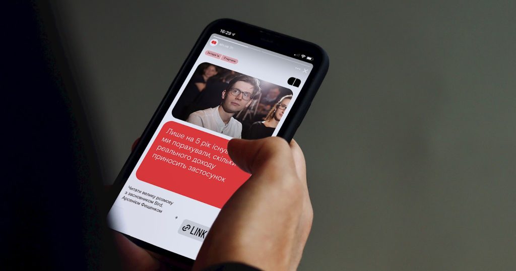
A message bubble of the old logo got a new sense thanks to rethinking the main function of this medium. Today, it’s not just a website but several different communication channels. But in the end, it all is being compressed into a unit of information, a message. The new symbol of AIN.UA is a segmented message from a messenger.
Two segments are an ‘a.’ If there are many segments, as many as subjects that AIN.UA writes about, you can see three letters in a message: a, i, and n. It is an abstract and simple symbol that inherited the old logo and got new senses. AIN.UA is a daily portion of information for a modern entrepreneur. It is one of many signals the new logo brings up.
Based on modular letters, we created symbols for AIN categories: Business, Tech, Work, and Community. All of them got their letters designed in the same way as the main logo.
Rethinking a modern media format impacted the layout and website design, which is still in progress. News feeds, stories, tabs, window layers—all this inspired us to create adaptive graphical elements that follow the logo form and build an adaptive and recognizable design system.
By font solutions, we wanted to leave behind a neutral current grotesque, so beloved among Ukrainian businesses and IT companies. To create an intelligent mood, we picked Skema Pro News. Why? To prepare AIN.UA readers for a serious vibe, a so-called monocle vibe but more digitally arranged.
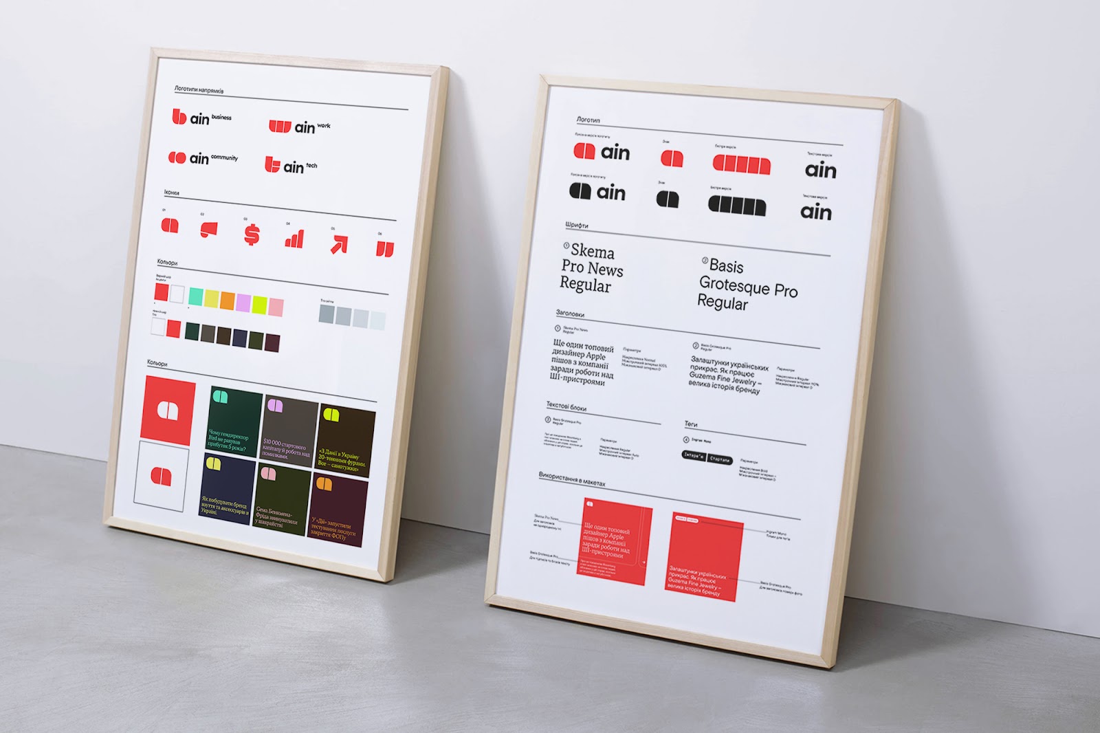
Concerning colors, only the central red was slightly updated. In addition, we assembled two bright and dark color sets that one can combine as they wish. So, put it together with a diverse set of forms and several perfectly matched fonts, and you will get a powerful tool for all possible modern manifestations.
The best part of cooperation with AIN was its team’s engagement. All brand identity design decisions are always for people who will work with it. The best thing that can happen to a project is when the brand team is engaged, knows well what they need, and can perceive critics of their product to aim for obviously better results.
We love to interfere in the product part, and this time, it helped us so much develop a new website, which we will discuss in our next article.
Authors: Anton Ivanov and Nata Ivanova, co-founders of the design studio CREVV
You must be logged in to post a comment.